Thursday, September 29, 2016

Albright Knox Visit

A.)  Which artworks make an impact or impression on me? Why?

One work of art I saw at the Albright Knox art museum that made an impression on me was Mississippi Gottdam by Mark Bradford. (102 x 144 inches, mixed media collage on canvas, 2007) This artwork left an impression on me because of the beautiful and interesting story behind it. After Hurricane Katrina destroyed New Orleans in 2005, Mark Bradford was upset by slowness and lack of cleanup and renovation in the city. In 2006, Bradford collected debris still left from Hurricane Katrina and used it to create Mississippi Gottdam. The completed work has deep indents of waves throughout the canvas, sanded down in certain places to show off the colorful debris from New Orleans. When looking at Mississippi Gottdam, you can see the giant tidal waves crashing over the canvas and the destruction they create, symbolized by the debris. I really loved the story and how he used his platform to bring awareness to rebuilding areas that were still being affected by Katrina.  


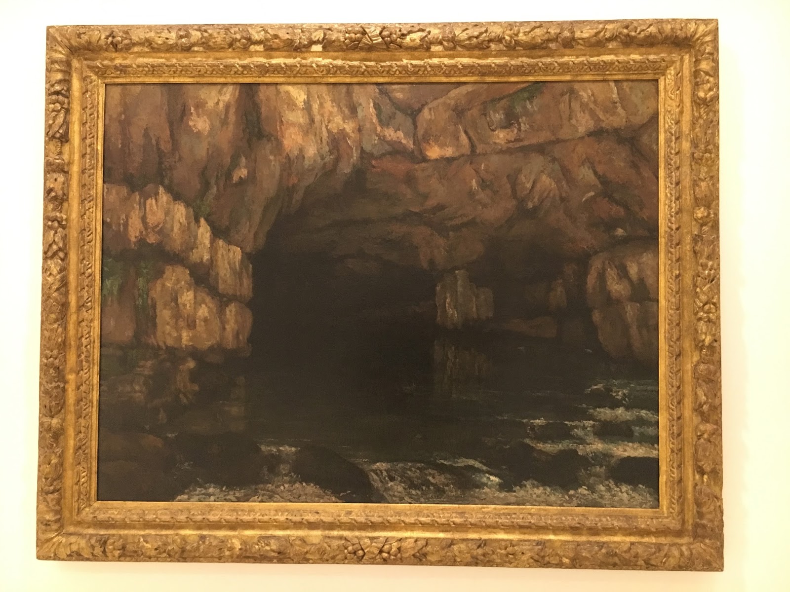
Another work of art that left an impact on me was La Source De La Loue (The Source of The Loue) by Gustave Courbet (1864, Oil on canvas, 42 1/4 x 54 1/8 inches) I wasn’t quite sure at first why this painting made such a deep impression on me at first. In fact, I walked away several times but kept wandering back to where it was to look at it. But I believe it left an impression on me because it was dark. All the paintings around it had colors and bright parts but this painting had a lot of black and neutral colors to it. Most of the other paintings that I have liked in the past have been colorful and vivid but not this one. I liked how the artist was able to create something so beautiful from a dark cave. I also loved the movement created by the flowing water and how the rocks disrupt and scatter the flow of the water. I sincerely felt that this painting was really beautiful and loved it a lot.


B.)  Which artworks do I feel a connection with? Why?

I felt a connection with Étude Pour "Le Chahut" by Georges Seurat. (oil on canvas, 26 5/8 x 23 x 1 inches, 1889) I felt a connection with this piece because I used to dance professionally and completely for years. I also am very involved in music and performance, so this piece brought back all my happy memories from when I was still involved and passionate about dancing, performing and music. I really felt connected to the dancers and musicians because I’ve been in their shoes, and have danced on stage and played instruments in a pit band. I loved the detail of the piece as well, its composed of tiny dots of color that make the eye think the coloring is solid from a distance but in reality it is not. The detail and art was stunning and really helped me connect with it emotionally be remembering my old passions.


I also felt a connection with the sculpture Under a Cloud by Jeanne Silverthorne (2003, Rubber, synthetic hair, Aqua-Resin, and Styrofoam, dimensions of figure: 4 x 1 ¾ x 3 inches; cloud: 12 x 15 x 10 inches) I felt connected with this piece because the artist created this to represent her mother’s struggle with depression. As someone who has a history and family members who also struggle with depression I felt the cloud was a nice metaphor for the depression. I identified with the figure because I knew how she must feel because I had been in her shoes before.


C.) Which artworks would I like to know more about? Why?

One painting I would like to know more about is The Marvelous Sauce by Jehan Georges Vibert. (Oil on wood panel, 25 x 32 inches, 1890.) I liked this painting because of the different textures in the tiles, aprons and stove as well as all the different colors. What I would like to know is who the people in the picture are. Did the scene mean something specific to the artist or was it just for fun? While investigating some of these questions I found that Vibert might have been making a political statement about the cardinal in red and his time spent away from the church, I would like to know if there is truth behind that or if he disliked the way the catholic church was run at the time.


Another painting I would like to know more about is the sculpture Telephone Time by Janet Cardiff and George Bures Miller (2004, sound installation on 2-minute loop, dvd, dvd player, telephone, desk, chair and lamp, dimensions variable). This piece was made up of a life sized desk, chair and telephone. At first I didn’t know why this desk setup was in the middle of the museum until a security guard must have noticed my confusion and told me that it was interactive. Unlike most art and sculptures that are meant to be seen and not touched, Telephone Time encourages the viewer to sit down, relax and pick up the phone. The phone has a sound recording in it that the viewer can listen to as well. The conversation is between the artist and a mathematician/monk who discusses the nature of time and space. I would like to know what inspired the artist to create an interactive work of art, and why it is a desk and chair. I would also like to know why the topic they discuss is the nature of time and space and not any other subject, like religion or math or even their favorite foods. I’d like to know the meaning of the piece as a whole and why they created the concept of this piece in the first place.


Sunday, September 25, 2016

Project #1

I thought that creating the value scale was messy. The charcoal kept smudging and I had to start over twice because I couldn’t get the right values. The vale scale was actually a lot more difficult than I expected because it was hard to anticipate how light/dark my next square would be in comparison to the previous one, I was honestly getting very frustrated by the end of the project.
         The color wheel was fun and easier. The paints were easy to mix and blend. However, the colors didn’t turn out exactly how I wanted them to, the green and the black came out nice, but even with the recommended golden brand paints, the magenta and the phthalo blue didn’t mix to create a different blue, it was very similar to my primary shade. In regards to the red, I thought it was very similar in color to the magenta, I would have liked a greater difference in shades.

         I enjoyed working with the paints the most because they were the easiest the move around the paper. The charcoal kept smudging and was ending up places I didn’t want it, but painting with a small brush was more precise and simple.

The most important thing I discovered was that drawing was harder than I thought. The skill, precision, focus, patience and devotion artists have to create entire works of art out of just charcoal is mind blowing to me. I didn’t expect working with charcoal to be as hard as it was. I came into this project thinking it was going to be so simple but I was quickly proven wrong, creating art is hard no matter what.


         The videos helped me a lot, especially in regards to the value scale. When I attempted to do it before watching the video I was so confused. I couldn’t get my gray scales how I wanted them to be, and it seemed like all my colors looked alike, but once I watched the video and saw how my colors should look in comparison to one another, I made a completely better scale. In regards to the color wheel, I thought it was very helpful to see how the wheel should be set up. I also liked how he mixed red, yellow and blue and showed a muddied and dull color wheel compared to mixing cyan, magenta and yellow (the true primary colors) to produce a bright color wheel. I learned that the true primary colors are cyan, magenta and yellow because red, yellow and blue are too dark to be the actual primary colors.


Sunday, September 18, 2016

Photo Album Project 1 Link


PhotoBucket

Project #1 Elements and Principles of Art


For our very first project in AED 200, this was pretty fun to do. I believe I was able to capture all the elements and principles of art pretty well. Some were pretty hard for me to find however, like contrast and unity. I didn't know what I should photograph or if it would be good enough to submit, those gave me the most stress I would say, but I got them finally at the end. 


Line is the most basic building block of formal analysis. Line can be used to create more complex shapes or to lead your eye from one area in the composition to another. For line, I photographed a telephone line outside my house, I liked the way the lines were silhouetted against the blue sky and traveled along the photograph, only being interrupted by the telephone pole.

Value is the degree of light and dark in a design. It is the contrast between black and white and all the tones in between. Value can be used with color as well as black and white. Contrast is the extreme changes between values. For value, my friend and I visited an aquarium. There was a sea turtle tank and every now and again he would swim by, so for the picture I thought it would be a great idea to take a picture of a person looking into the tank at the turtle when it passed by. The person would be completely silhouetted against the tank while the turtle and other fish would still be lit up. The contrast between the blackened person and the colorful tank really shows up well.

Shapes are created when lines are combined to form a square, triangle, or circle. Shapes can be organic (irregular shapes found in nature) or geometric (shapes with strong lines and angles such as circles, triangles, and squares). For shape, I photographed the backsplash behind my kitchen stove. I liked the strong geometric squares and triangles in the design.

Forms are three-dimensional shapes with length, width, and depth. Balls, cylinders, boxes and pyramids are forms. For form I had an excuse to bake chocolate chip cookies. After I finished making the dough, I rolled them up into balls and placed them on a baking sheet, I thought the 3D effect of the spheres of dough would work well with forms.

Space is the area between and around objects. Increasing or decreasing the amount of space around an object affects the way we view that object. Two weekends ago my family and I went to Florida to for my grandma's birthday. While we were there I photographed a palm tree against a clear blue sky. The space surrounding the palm tree really highlights the intricacies of the leaves and trunk so you can clearly see the detain better than if I had photographed a series of palm trees with no space between them.

Color differentiates and defines lines, shapes, forms, and space. Even black and white images have a huge number of different shades of gray. Also while we were in Florida we visited a Spanish street market. All the bright and vivid colors of the fruits, leaves and melons really captivated me. I love all the different shades of red, yellow and orange. No two colors and fruits are alike and it was just so beautiful to look at I had to take a picture.

Texture is the surface quality that can be seen and felt. Textures can be rough or smooth, soft or hard. Textures are often implied. For instance, a drawing of a rock might appear to have a rough and hard surface, but in reality is as smooth as the paper on which it is drawn. For texture I photographed a flower in a mulch bed in my back yard. The rough mulch chips and the smooth leaves of the flower are clearly shown. I feel as if I can feel the bumpy and rugged chips whenever I look at this photo.

Balance is created in a work of art when textures, colors, forms, or shapes are combined harmoniously. In this photograph, I created balance by dividing the image into two sections. The top half has buildings and trees while the bottom half has water. 


Contrast is the use of several elements of design to hold the viewer's attention and to guide the viewer's eye through the artwork. For contrast, I photographed the divide between the grass and my back patio in my backyard. The spiky texture of the grass contrasts with the smoother texture of the stone, the bright green color of the grass also contrasts with the pale grey of the stone as well. There is also balance in this photo, the right half occupied by grass and the left half with stone. This picture was the hardest for me to find, I had photographed other photos I thought had contrast in them, like a dozen purple crayons and one blue, but it just didn't feel good enough until I found the grass and patio scene in my backyard.


Movement is the way a viewer's eye is directed to move through a composition, often to areas of emphasis. Movement can be directed by lines, contrasting shapes, or colors within the artwork. For movement I photographed the jet in my pool. The jet propulsion created a rippling effect on the surface of the water that the eye can move up the photograph with. 

Emphasis is created in a work of art when the artist contrasts colors, textures, or shapes to direct your viewing towards a particular part of the image. For emphasis I photographed my dog, Bradley, sitting in a pool of sunlight on my living room floor. I liked how the sun light him up against the dark rug, making him the central focus of the scene. I was actually inspired by the painting in our textbook, Executions on the Third of May by Goya. In that painting, the central focus of the scene is given to a man about to be killed, but he is much brighter than the rest of the people surrounding him because he is being lit up my a near by lamp. I like how Goya had given him emphasis by simply lighting him differently. 

Pattern is the repetition of a shape, form, or texture across a work of art. For pattern, I photographed the outside brick of my house. I liked how the brick seemed to go on forever creating a never ending pattern.

Proportion is created when the sizes of elements in a work of art are combined harmoniously. For promotion, I photographed a giant chair. Obviously, the chair is much bigger than a normal chair, throwing the preconceived notion of a normal sized chair out the window when one looks at my photo.  
Unity is created when the principles of analysis are present in a composition and in harmony. For unity I photographed a bridge scene I found while hiking. I thought this photo embodied unity. The lines of the tree trunks cut across the scene and transport us from side to side of the photo, the texture of the wooden bridge and the pattern of the railing design are all important elements of the photo. The scene is also balanced, with the top half being trees and leaves while the bottom half is the bridge and railing. Overall, I loved this picture and how all the elements and principles come together.


Once I had taken all the photos, it was no problem to create a photobucket account and upload the pictures to my computer. From there all I had to do was label them. The technical aspect of this project was fairly simple once I got the hang of how photo bucket worked.